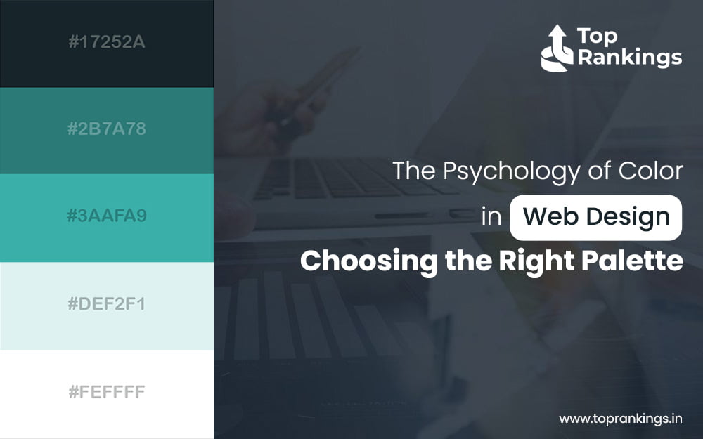
Colour is a potent tool that impacts perception, behavior, and emotions in addition to being a purely aesthetic component. The choice of colour scheme in web design may greatly affect the user’s experience. Understanding the psychological characteristics of colour helps web designers to produce visually appealing websites that efficiently deliver their intended message. This article delves deeply into the psychology of colour in web design and offers tips on selecting the right colour palette for your website.
The Power of Color in Web Design
Colour affects how visitors engage with a website. It can arouse emotions, draw attention, and even increase conversions. Given their psychological effects, personal experiences, and cultural meanings, different colours can trigger diverse reactions in people.
Red signifies energy, excitement, and urgency. It’s often used in call-to-action buttons to promote making decisions quickly. On the other hand, an excessive amount of red can be overwhelming and induce anxiety.
Blue shows professionalism, serenity, and trust. Businesses and financial institutions frequently choose it for their web pages. Because blue is a relaxing colour, people may feel more at ease and safe.
Green is connected to peace, health, and the natural world. It is frequently utilized on websites about finances, fitness, and the environment. Green is a great colour for brands that support sustainability since it may symbolize growth and harmony.
Yellow conveys warmth, optimism, and joy. It draws attention and is frequently used as an accent. On the other hand, too much yellow can be overstimulating and lead to visual fatigue.
Black represents wealth, style, and elegance. It’s standard on websites for upscale brands. When used properly, black may have a powerful visual impact; yet, if overdone, it can give the impression that a website is gloomy.
White represents simplicity, cleanliness, and purity. This colour is adaptable and can be used as a background to improve readability and create a neat, uncluttered appearance.
Choosing the Right Palette
1. Understand Your Audience: To select the ideal colour scheme, you need to understand who your target audience is. Colours can trigger diverse reactions among groups of people. For instance, younger audiences might choose bright, strong colours, whereas older audiences might favour softer, more muted hues.
2. Define Your Brand Identity: The colours on your website should be consistent with your brand. Take into account the feelings and ideas you wish to portray. While bright, vibrant hues are used by children’s toy stores to express pleasure and excitement, blue is a sign of trust and innovation for software companies.
3. Use the 60-30-10 Rule: A harmonious colour scheme can be created by applying the 60-30-10 rule. Hence, the colours on your website should make up 60% of the main colour, 30% of the secondary colour, and 10% of the accent colour. This promotes harmony and directs users’ focus.
Developing a strong online presence requires understanding the psychology of colour in web design, which is both fascinating and important. You may select a colour scheme that improves user experience and increases engagement by knowing how emotions and behaviour are affected by specific hues. Keep in mind that the proper colours may direct user behaviour, convey the story of your business, and ultimately help your website succeed. Therefore, explore the realm of colour psychology and actively paint your web canvas!